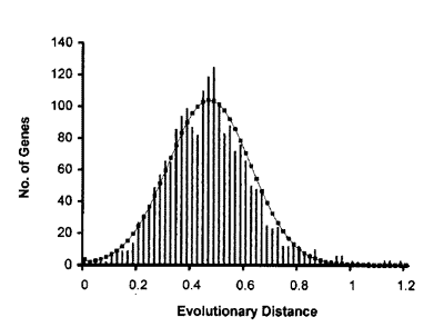
Consider men and mice. They share the vast majority of their genes. If they are related by a common ancestor than one can model how genes might be expected to change over time. Lets try a very simple model. One might imagine that every point in a gene is has x probablity of mutating in any given amount of time. Sure this likely to vary from gene to gene and time to time; but over many genes and long periods of time it not unreasonable to expect it to average out. So that is the model we will consider.
Now consider something about statistics. If one flips a fair coin one thousand times, one is unlikely to get exactly 500 heads and 500 tails. If one performed many trials of thousand coin tosses, and plotted the number of heads versus how many times got that result one would get a bell-shaped curve: the most common result would be 500 heads with the number of occurances getting rarer as one gets further from 500 heads. The exact curve can easily be predicted by elementary statistics.
One can create something rather similar for genes of mice and men. Given a mutation rate and how long since the supposed common ancestor, one can draw a theoretical curve for the distribution of how different human and mouse genes are. On average a single gene will be expected to be x different, but sometimes it will be more different and sometimes less different in accordance laws of probability.
This has been done with a data set of 2,019 genes of mice and men. The result is in the image below. The solid curve is the expected curve generated by elementary statistics using the assumption of a constant mutation rate over time. The bars are actual data.
The fit is simply remarkable.
I can't imagine any way an evolution denier would expect to see anything like this. It is certainly not necessary from any notion of "design." And yet its evolutionary explanation is obvious, simple, and natural.
The image was taken from
29+ Evidences for Macroevolution: A Response to Ashby Camp's "Critique". If anyone wants to read this, it would probably be best to start at the
beginning. The peer-reviewed research publication that generated the data set and was the original source of the graph is
Mutation rates in mammalian genomes (PNAS. January 22, 2002. vol. 99, no. 2, pp. 803-808.)