|

Understanding through Discussion |
|
|
Register | Sign In |
|
QuickSearch
| EvC Forum active members: 63 (9162 total) |
|
| |
| popoi | |
| Total: 916,393 Year: 3,650/9,624 Month: 521/974 Week: 134/276 Day: 8/23 Hour: 0/4 |
| Thread ▼ Details |
|
Thread Info
|
|
|
| Author | Topic: How about a new Logo? | |||||||||||||||||||||
|
ohnhai Member (Idle past 5183 days)  Posts: 649 From: Melbourne, Australia Joined: |
Thankyou for the kind words but...
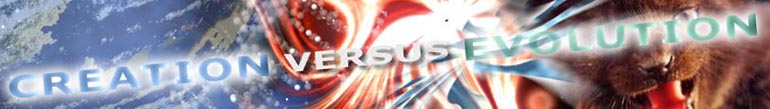
What else would you use for Evolution? Evolution is the selection through natrual means of changes in the DNA code over time. There is little space to represent this fully and so I selected a representation of DNA as the best 'stand in' for this concept. If I had chosen "Madonna of the rocks" then your comment in regard to 'religious art would be valid. I didn’t. As you well know the image used is from the 'Creation of Adam'. A universally well known image, that directly depicts God in the act of creation. I could not think of a more fitting image to symbolise creation, by a divine being(or intelligent agent). Also from a design point of view the two sides worked together to create a nice curving flow from bottom left to top right Not wanting to get into a fight: just wanted to state my rational. Finally I do think the consensus it should be Evolution and Creation sans the -isms.
|
|||||||||||||||||||||
|
Legend Member (Idle past 5027 days)  Posts: 1226 From: Wales, UK Joined: |
I quite like it!
"In life, you have to face that some days you'll be the pigeon and some days you'll be the statue."
|
|||||||||||||||||||||
|
Buzsaw Inactive Member |
Percy writes: Moderators: this is off-topic, I'm guilty, punish me as you will. It was tempting but I won't go admin status and sentence you to a one hour suspension for the sole purpose of meditation on what you are going to say to your supreme theist almighty god when he asks you why your website didn't give him credit for intelligently designing you.  Edited by Buzsaw, : add quote BUZSAW B 4 U 2 C Y BUZ SAW ---- Jesus said, "When these things begin to come to pass, then look up, and lift up your heads, for your redemption draws near." Luke 21:28
|
|||||||||||||||||||||
joshua221  Inactive Member |
Yeah, flip it back around and we're good.
Why is it like that anyway?
|
|||||||||||||||||||||
|
Archer Opteryx Member (Idle past 3618 days)  Posts: 1811 From: East Asia Joined: |
Number 5.
I like it as it stands. But if labels are an issue we have the slang: EVOvCREO It's symmetrical, succinct, and conducive to good design.Viewers are free to complete the abbreviations as they please. __ PS - Thanks to the artist of Number 4 for the hint of taichi. Edited by Archer Opterix, : Messing around. Archer All species are transitional.
|
|||||||||||||||||||||
|
Archer Opteryx Member (Idle past 3618 days) Posts: 1811 From: East Asia Joined: |
Tusko: I don't think there is necessarily a problem with God v DNA as iano suggested. After all both of those images can mean a lot of different things. DNA might be an emblem of how cool God is to creationists. And it looks sexy. I agree. I like the choice of images. There's a subtle interaction happening. The design isn't just about one side 'versus' the other. Each image leads your eye into the other. The viewer is invited to explore connections as well as note contrasts. Elegant. Very nice. _ Edited by Archer Opterix, : HTML. Archer All species are transitional.
|
|||||||||||||||||||||
|
Trump won Suspended Member (Idle past 1260 days)  Posts: 1928 Joined: |
Nevermind.
the best option would be the cover of the "Hoop dreams" dvd or something. Edited by -messenjah of one, : one of Edited by -messenjah of one, : nm
|
|||||||||||||||||||||
|
mike the wiz Member  Posts: 4755 From: u.k Joined: |
I'm glad. I tried to make it a bit more interesting in this version:
I also like the one the others like, out of those others.
|
|||||||||||||||||||||
|
jar Member (Idle past 415 days)  Posts: 34026 From: Texas!! Joined: |
mike, try something at 770x109 so that the shape matches the other ones.
Aslan is not a Tame Lion
|
|||||||||||||||||||||
|
NeuroCycle Inactive Member |
I like your alternate to the design, provides better color difference between the two sides.
I think that the filters you used could be town down just a bit, to provide a bit more detail to the photos. I can get the DNA from it but the painting is too detail and the filter blurs it up too much to really tell what it is. My 2 cents, coming from a aspiring graphic designer (schooling is the progress)
|
|||||||||||||||||||||
|
mike the wiz Member Posts: 4755 From: u.k Joined: |

Edited by AdminJar, : No reason given.
|
|||||||||||||||||||||
|
RAZD Member (Idle past 1426 days)  Posts: 20714 From: the other end of the sidewalk Joined: |
I was looking at that and thinking put the "evolution - creation" at an angle blending into the picture sides funneling into the "v" and with the "E" and "C" contrary and the v in the center
|
|||||||||||||||||||||
|
ohnhai Member (Idle past 5183 days) Posts: 649 From: Melbourne, Australia Joined: |
intresting, but has the unwanted side efect of creating a set of virtual scales that unintentionally implies greater value for what ever initial is placed at the top. It sets up 'higher-lower' 'top-bottom' conciderations that unfairly unballance the image and more importantly the infered value of the two sides in the viewer.
|
|||||||||||||||||||||
|
ohnhai Member (Idle past 5183 days) Posts: 649 From: Melbourne, Australia Joined: |
You have something nice happening with the line created across the monkey's back rolling into the curve of the foreground hills on the other side. But the typography is disastrously weak.
Whilst the choice of images is important I feel that the main purpose of this logo is to assert and set an identity for EvC as a whole. In that regard the text is just as important as the images, and if I’m honest, would suggest even more so. The text exhibits as three utterly separate elements that stand off from each other, and don’t work as a whole, to sell the site’s identity. The ”VS’ is much bigger than the other two words, and thus dominates them. Drowning them out. You loose their message. Finally the choice of colour for the text (three different strong colours) also serves to alienate each element, making them fight for dominance rather than working as cohesive whole. It is worth having another look at the text, because as I said you do have the beginnings of something interesting with those background images. Have a look in the print media and on packaging and on TV and examine all those professionally designed logos out there. Keep an eye out for how strength, cohesiveness and balance are approached.
|
|||||||||||||||||||||
|
ohnhai Member (Idle past 5183 days) Posts: 649 From: Melbourne, Australia Joined: |
Noted. Bt Unfortunately the origional image (creation) has FAR less contrast thant he DNA image and without the golden highlights to ballance the blue ones on the DNA side the creo side looks very flat and lifeless. I will see what I can do to re-assert some definition into god's face and arm (the two key elements of the image).
Thanks for the feedback.  this has been really usefull. we have allready gone from this this has been really usefull. we have allready gone from this
which is much, much stronger . thakyou all Edited by ohnhai, : No reason given.
|
|||||||||||||||||||||
|
|
Do Nothing Button
Copyright 2001-2023 by EvC Forum, All Rights Reserved
![]() ™ Version 4.2
™ Version 4.2
Innovative software from Qwixotic © 2024


